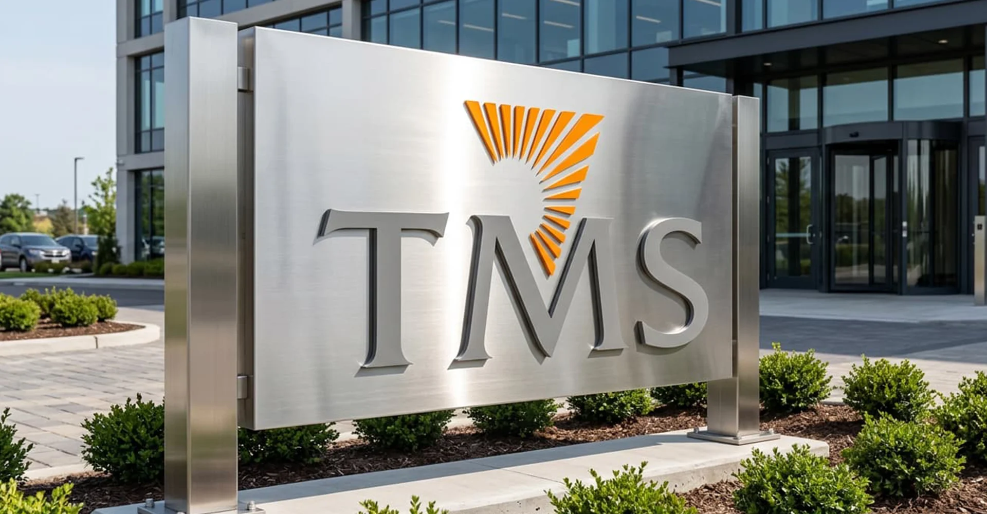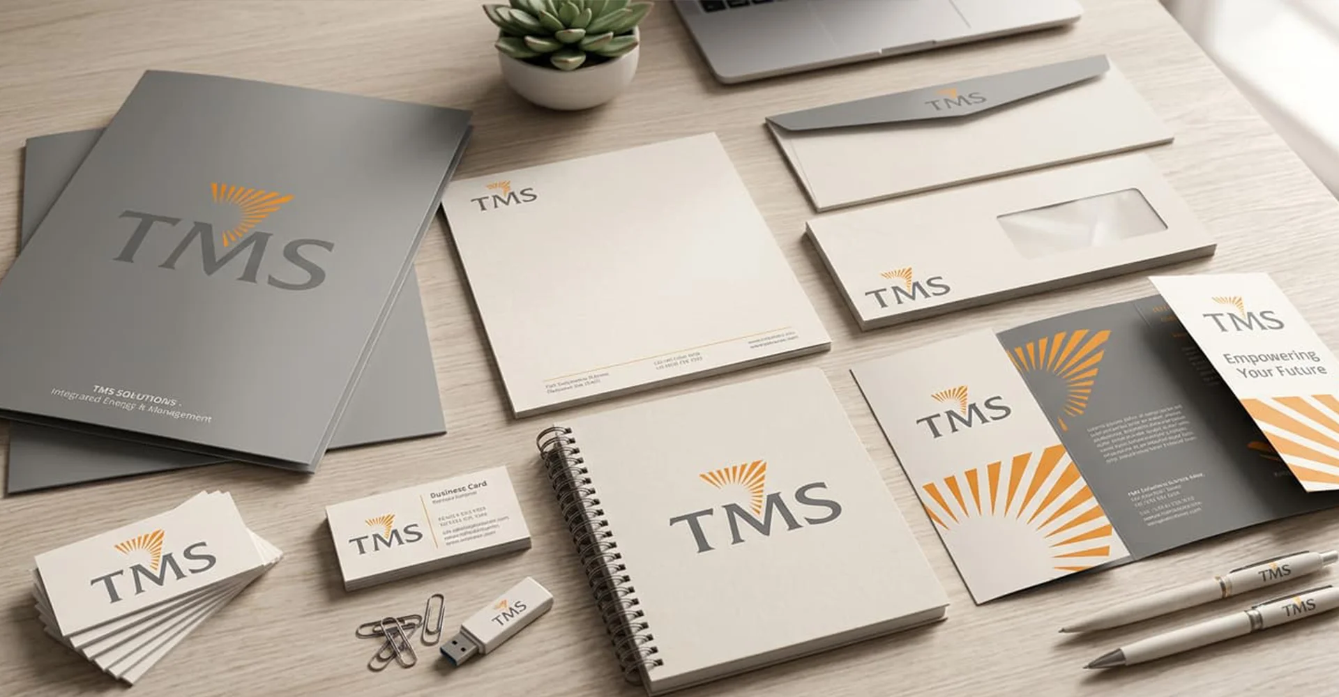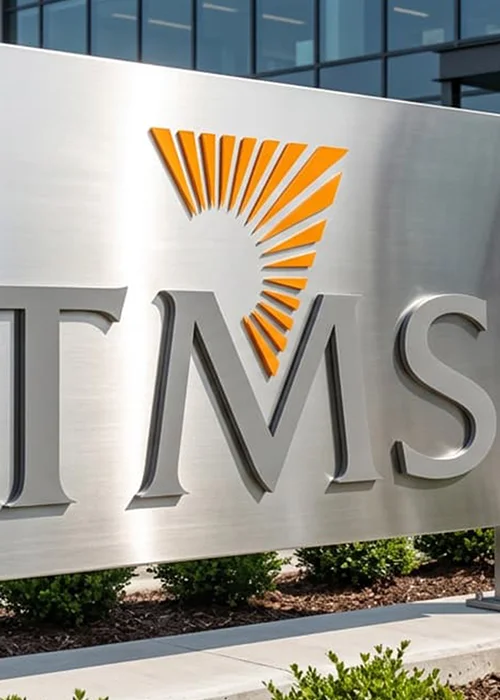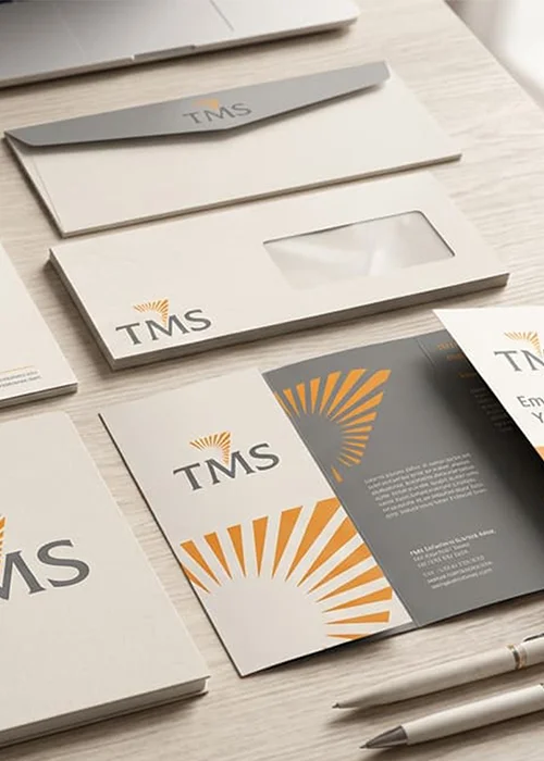
The brand identity for TMS Group is thoughtfully crafted to embody power, stability, and enduring excellence. The dynamic rays emerging from the symbol represent strength, growth, progress, and the far-reaching impact of the company’s vision. These radiating elements evoke energy and momentum, re ecting the organisation’s ability to build strong foundations and shape future-ready infrastructure with condence and precision. Complementing the bold symbol is a rened classical typeface that brings a sense of heritage, trust, and timeless sophistication. The font conveys the company’s deep-rooted values, integrity, and commitment to quality, reinforcing a legacy built on reliability and excellence. Together, the powerful rays and the elegant typography create a distinctive identity that balances modern ambition with enduring tradition, positioning the brand as a symbol of strength, credibility, and visionary leadership.