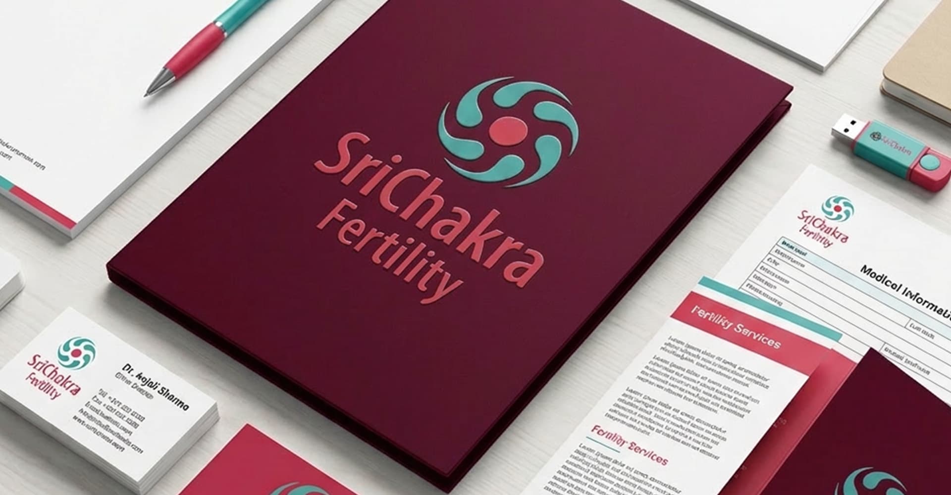

The brand identity for Sri Chakra Fertility has been thoughtfully developed around the concept of the journey of creating new life. The graphical symbol captures the essence of fertility, growth, and hope through a refined and contemporary visual language that reflects both science and human emotion.The icon represents new-age fertility treatments supported by compassionate, personal, and attentive care, reassuring patients through a balance of medical expertise and emotional sensitivity. The design conveys warmth, trust, optimism, and professionalism, helping to create a comforting and progressive identity for the clinic. Beyond the logo, the entire branding system; including signage, stationery, forms, patient communication materials, and other functional touchpoints; has been carefully designed to enhance clarity, ease of use, and patient experience. Every element was developed with functionality and accessibility in mind, ensuring a seamless and reassuring interaction at every stage of the patient journey. The cohesive and thoughtfully executed branding has played a significant role in strengthening the clinic’s presence and credibility, helping Sri Chakra Fertility expand successfully and grow well beyond its initial expectations.